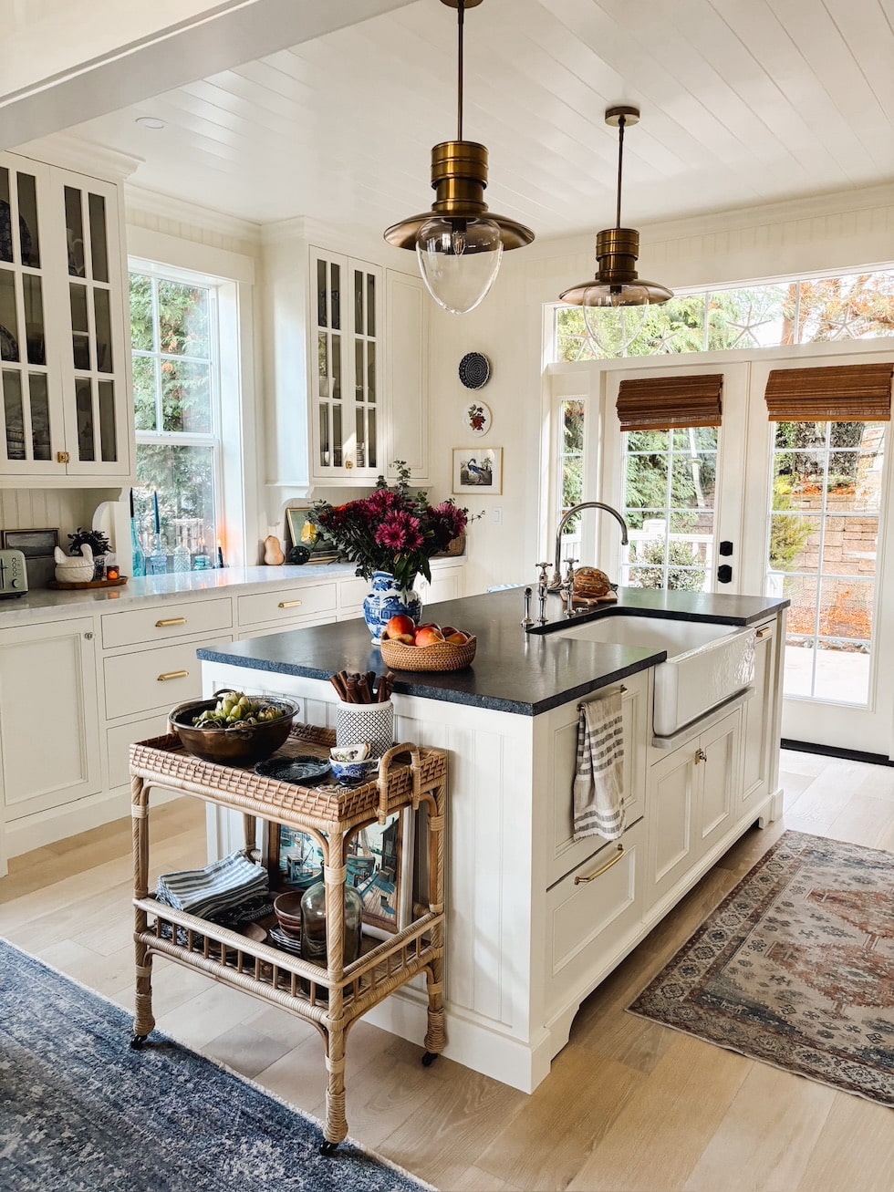
Welcome to our Coastal Cottage Kitchen Reveal! The day has finally come when we are “done enough” to invite y’all in for the first official “reveal” of our new kitchen and dining area!
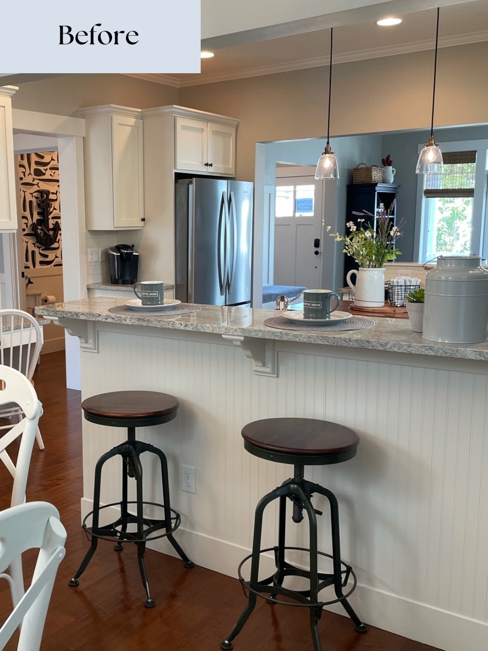
Two years ago we moved into what we hope will be our forever home, a smallish coastal cottage on an island in Washington state! We fell in love with this house, it was cute and just the right size for us as empty nesters plus it’s within walking distance to the beach!
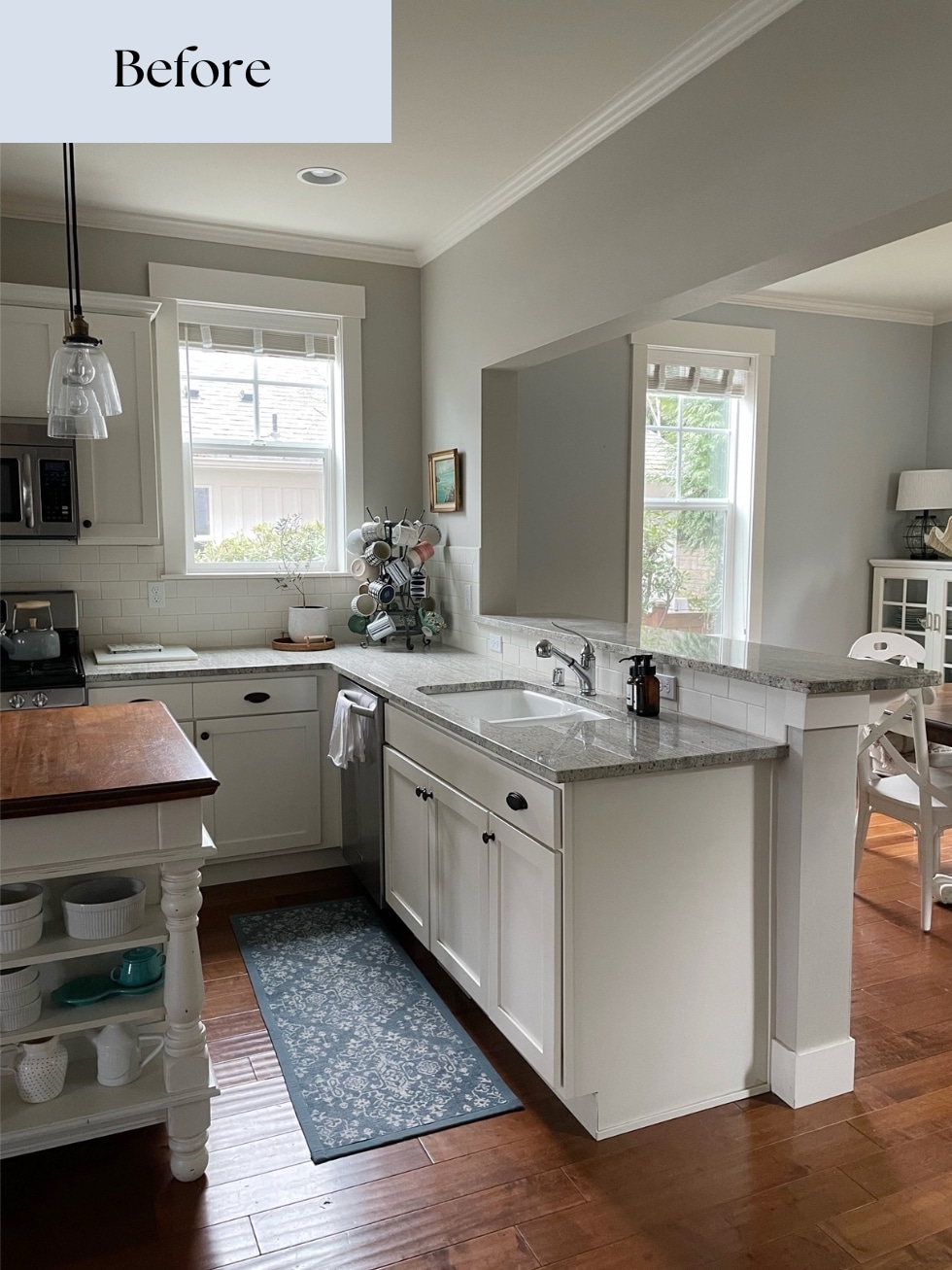
In a 9 month renovation that began last winter (and design planning that began nearly two years ago) we added a tiny cottage to the back of our home for my parents and made updates to our 750 square foot main floor to accommodate changes that were needed for the addition. In the redesign, we were able to move the location of our former kitchen into the existing dining room which resulted in a functional layout with more natural light and additional storage for our family!
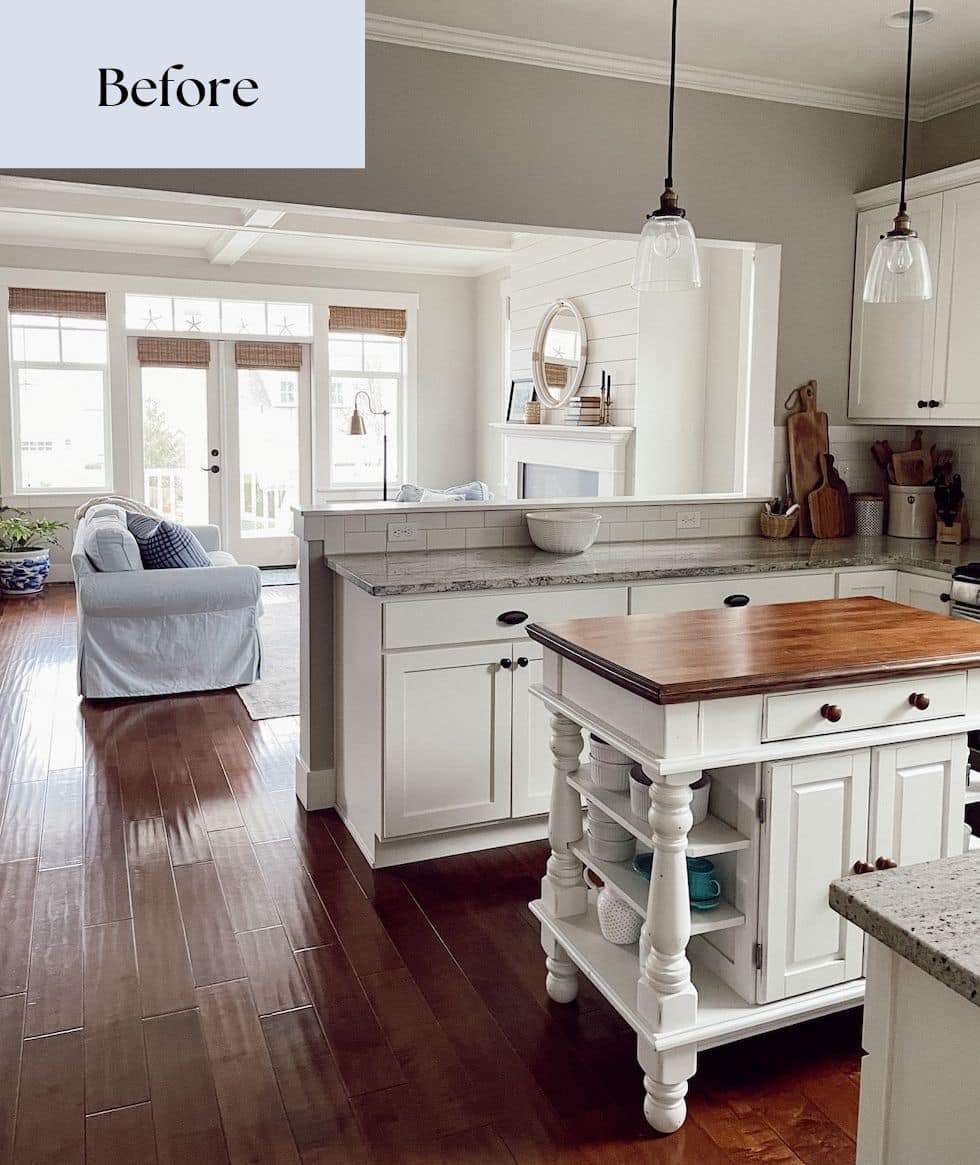
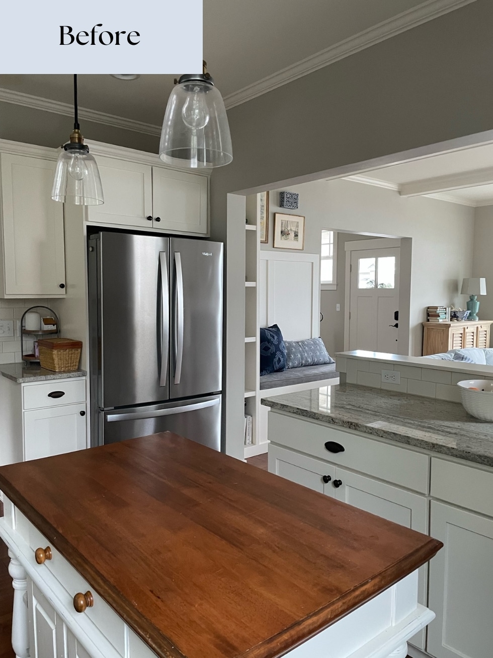
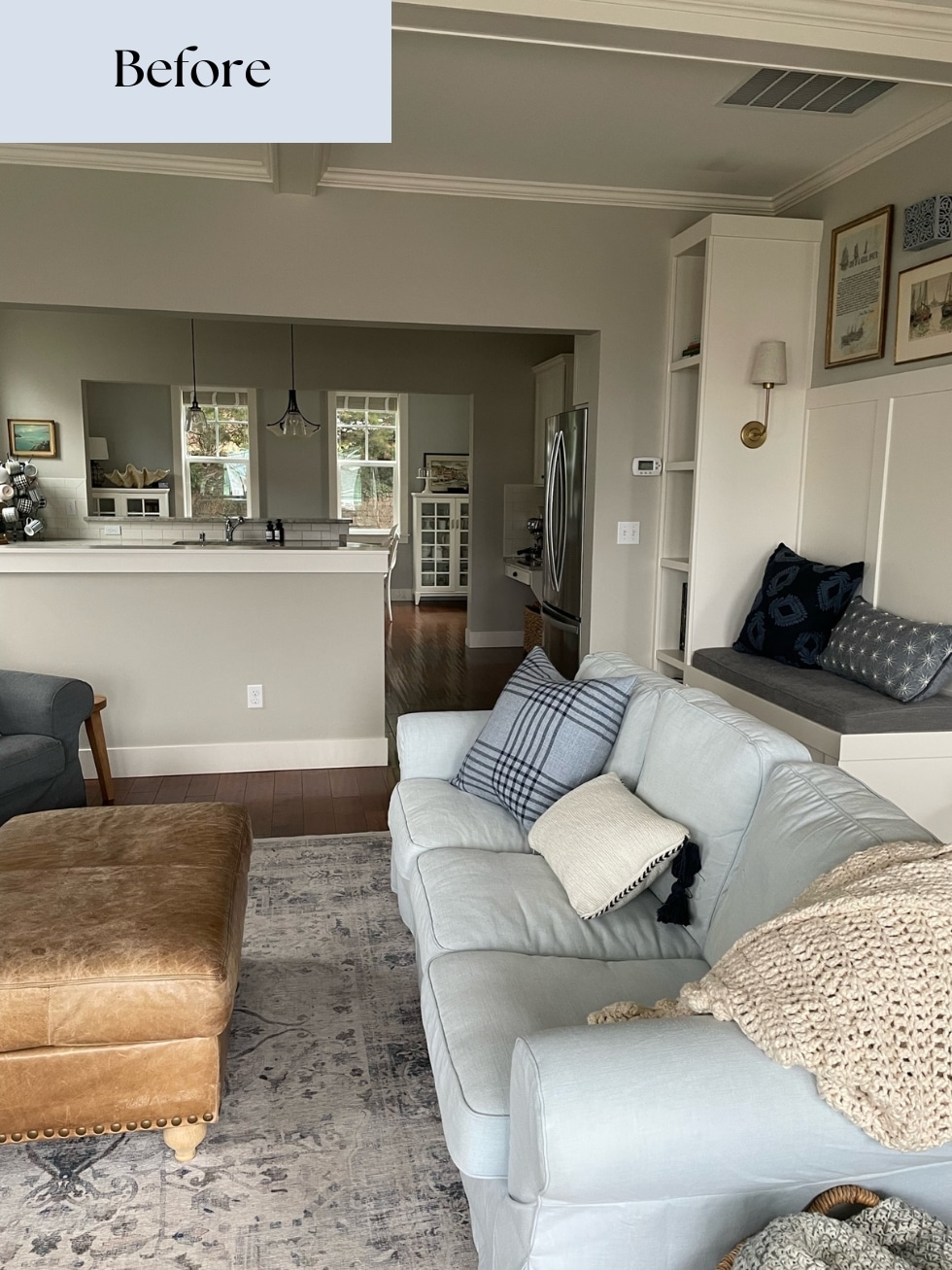
In this post I’ll share some “after” photos as well as some of the “before” photos so you can see where we started and where we ended up. There will be more posts to come and I will share more many details and photos. Today will be part one!
You will also find a full source list at the end.
Below is a short video of our kitchen, then scroll down for all the photos and details!
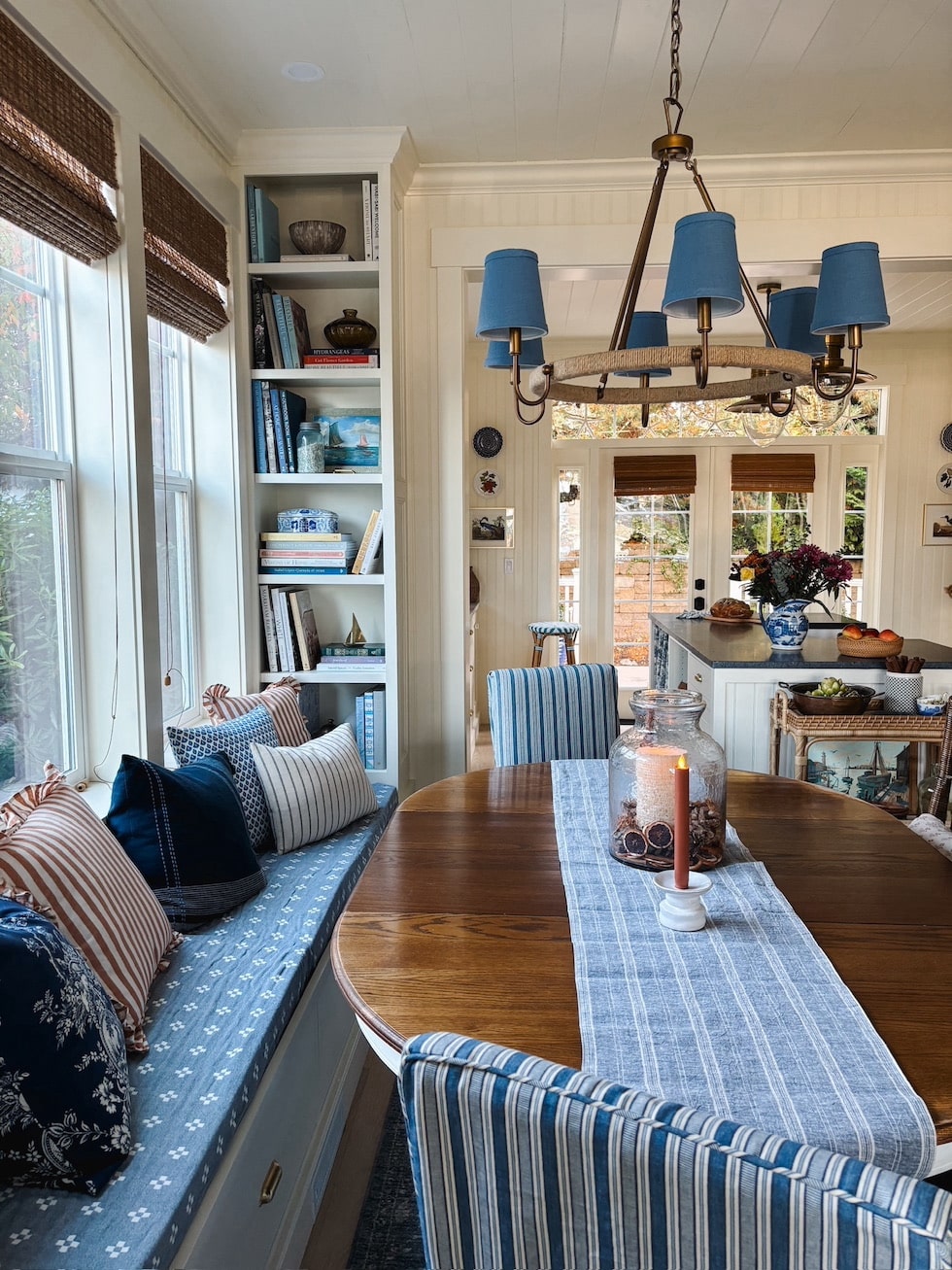
We didn’t move any exterior walls, so everything you see in our “after photos” was added within the existing footprint.
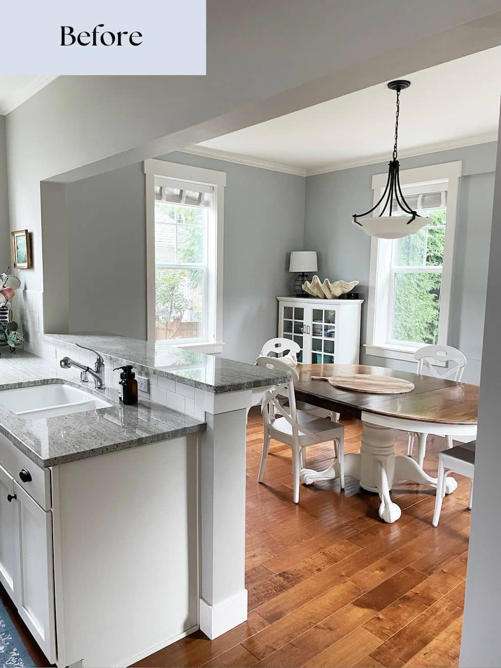
The new kitchen was designed to fit within walls of previous dining room. Both the existing kitchen and the dining room were essentially the same size, but because we were able to move the location of the kitchen we were able to fit in more cabinetry and counter space as well as create better traffic flow between all three of the main floor rooms (we also have the mudroom, powder room and entry which I’ll share in a future post).
We added the French doors to a new deck so we can access the backyard (our previous back door access which was located in our mudroom was closed off due to the addition of the Tiny Cottage). Previously on that wall we had two windows, so the addition of the new doors with the transom and sidelights across the back wall brought in a lot more light!
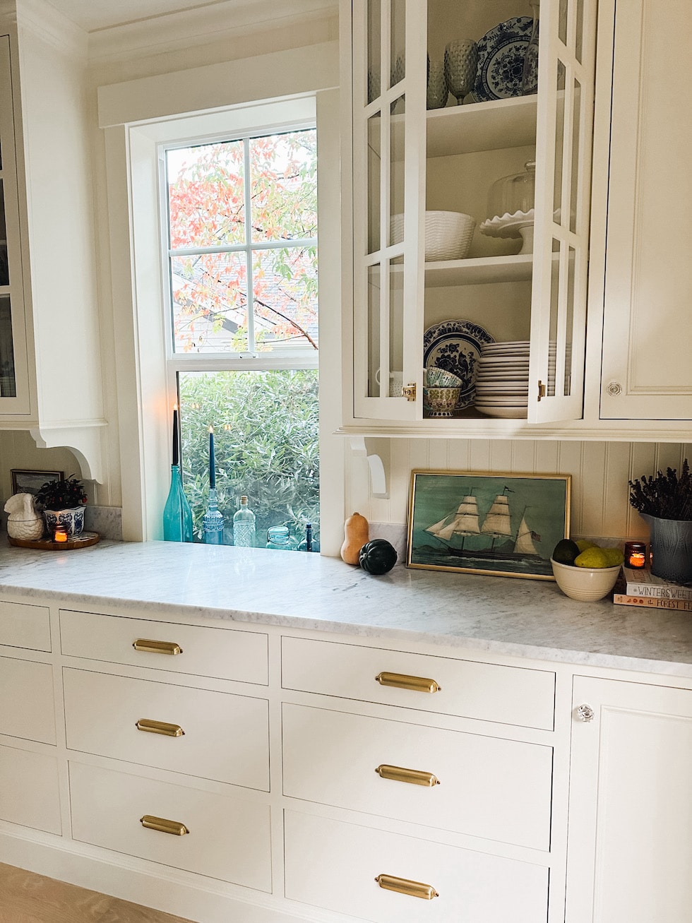
The side window in the new kitchen was in the former dining room, so we just left it in place and just ran the counters across it since it was a few inches too low (like they often do in older homes!).
Besides swapping the locations, we also raised the two headers between the rooms. They were so low before that lifting them a few inches improved the sight lines, improved the flow of light and made each space feel more connected. The openings between the rooms were also widened just a little bit, but we left them in place to retain a slight sense of separation and coziness for each space.
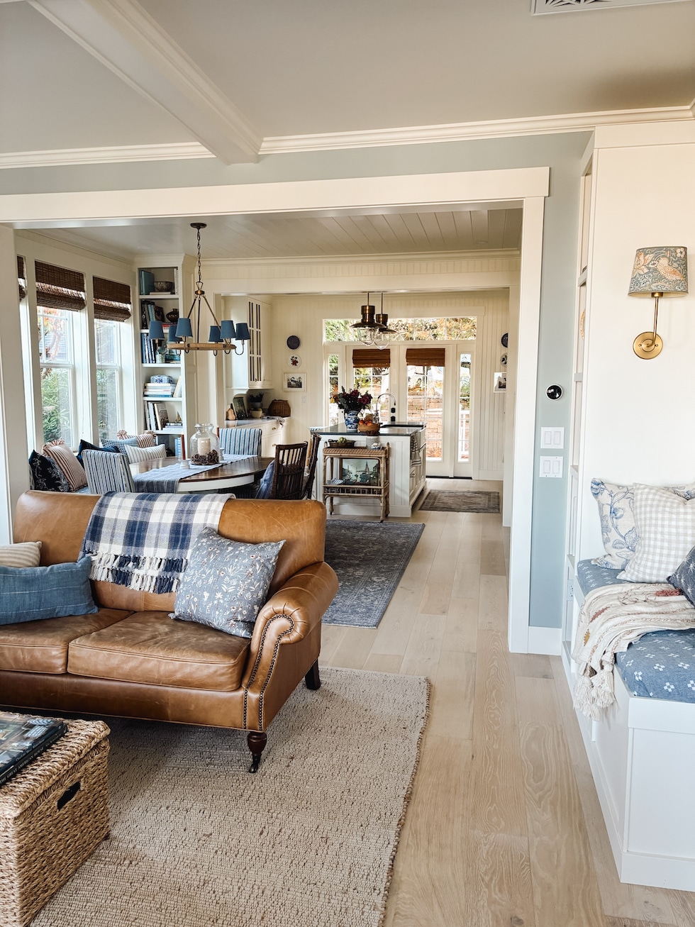
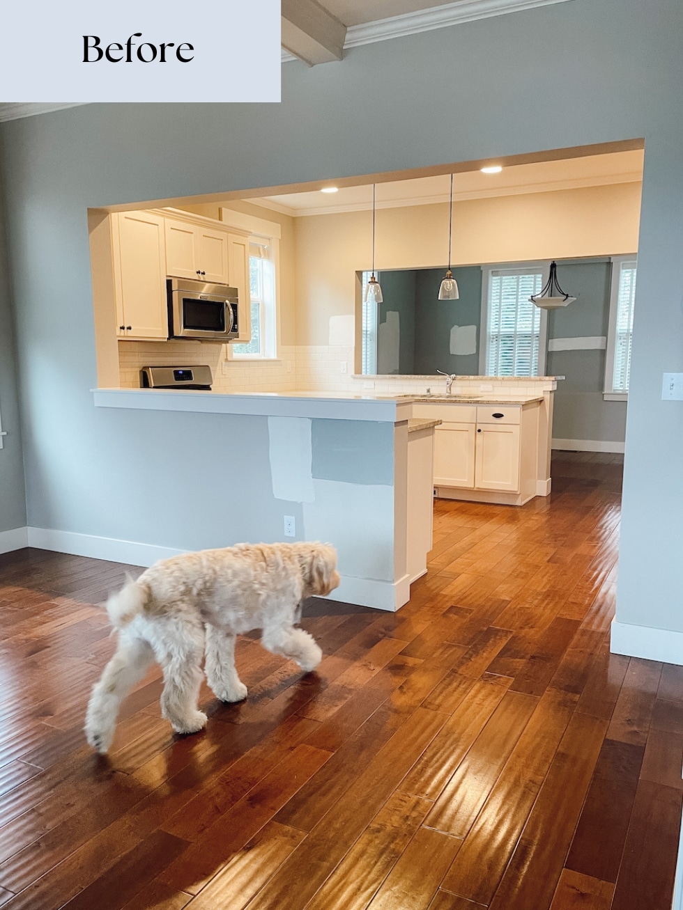
By swapping the two rooms we were able to remove the two peninsulas. While they were necessary for the kitchen in the prior arrangement, they also took up space in all three rooms. We’re so pleased with the new layout as we were able to create a more spacious kitchen, dining area and living room without adding any square feet!
We have a growing family with three adult children, one grand babe on the way (and many extended family) who all live in the NW so we knew we’d host many holidays and get togethers here! While our home is still about 1900 square feet, we have created more room for people to gather, plenty of storage and a comfortable place my husband and I enjoy day to day.
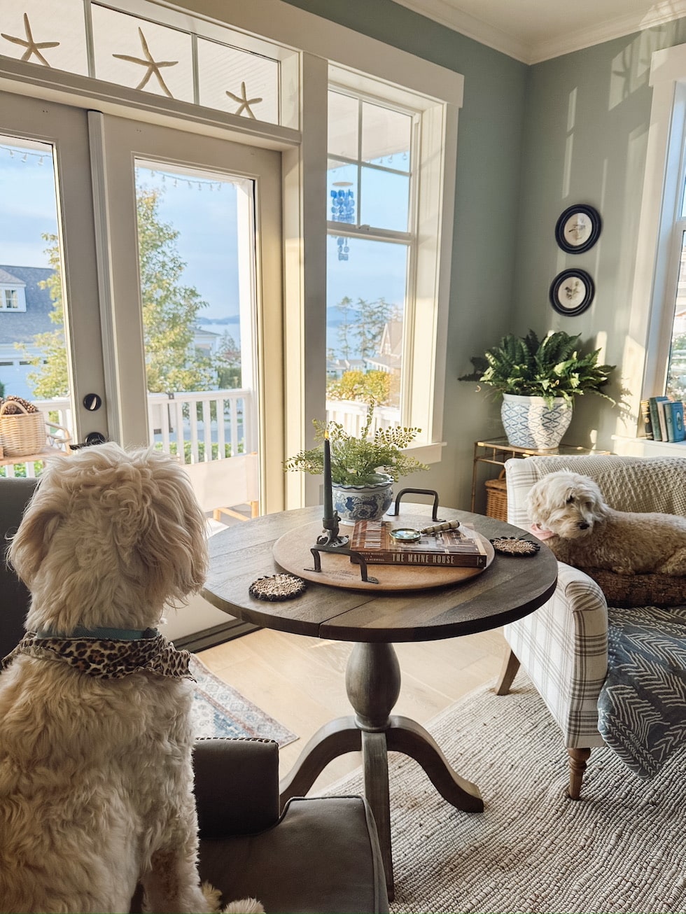
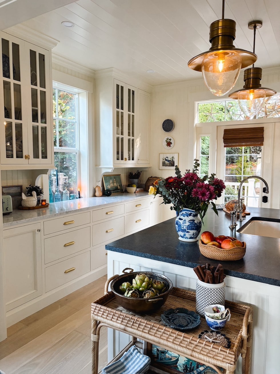
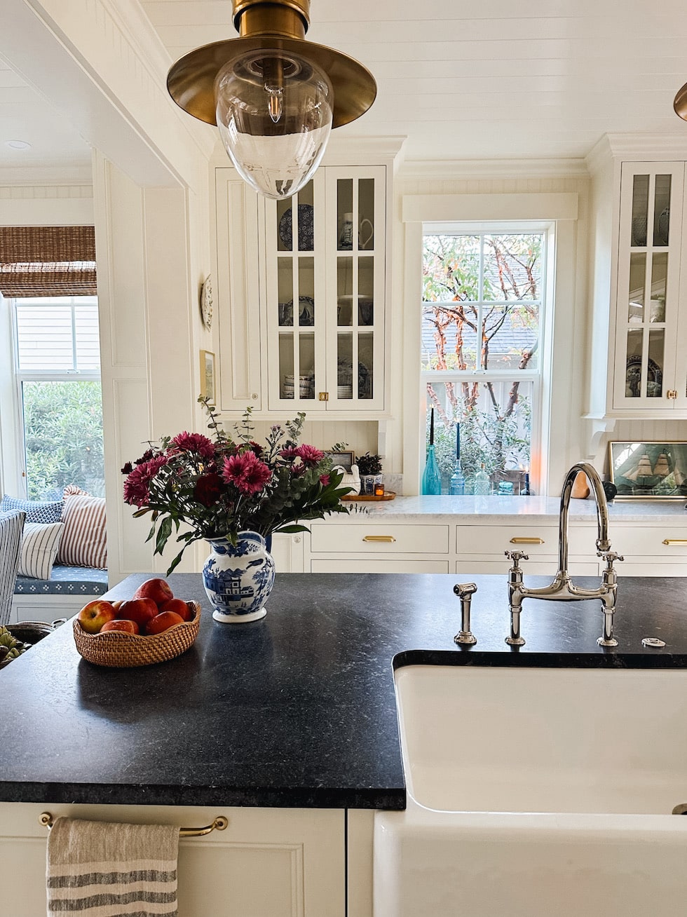
Our dining and living room windows have all have views of the water that we can enjoy from our kitchen sink and island! We didn’t realize our dining room would have a view of the water to the side, so that was a happy surprise. The sink is located in the ideal location to not only enjoy the views from every window, but it also allows for conversation when people are gathered across the island (we even added a little cubby for a stool to sit at!) or from the dining nook.
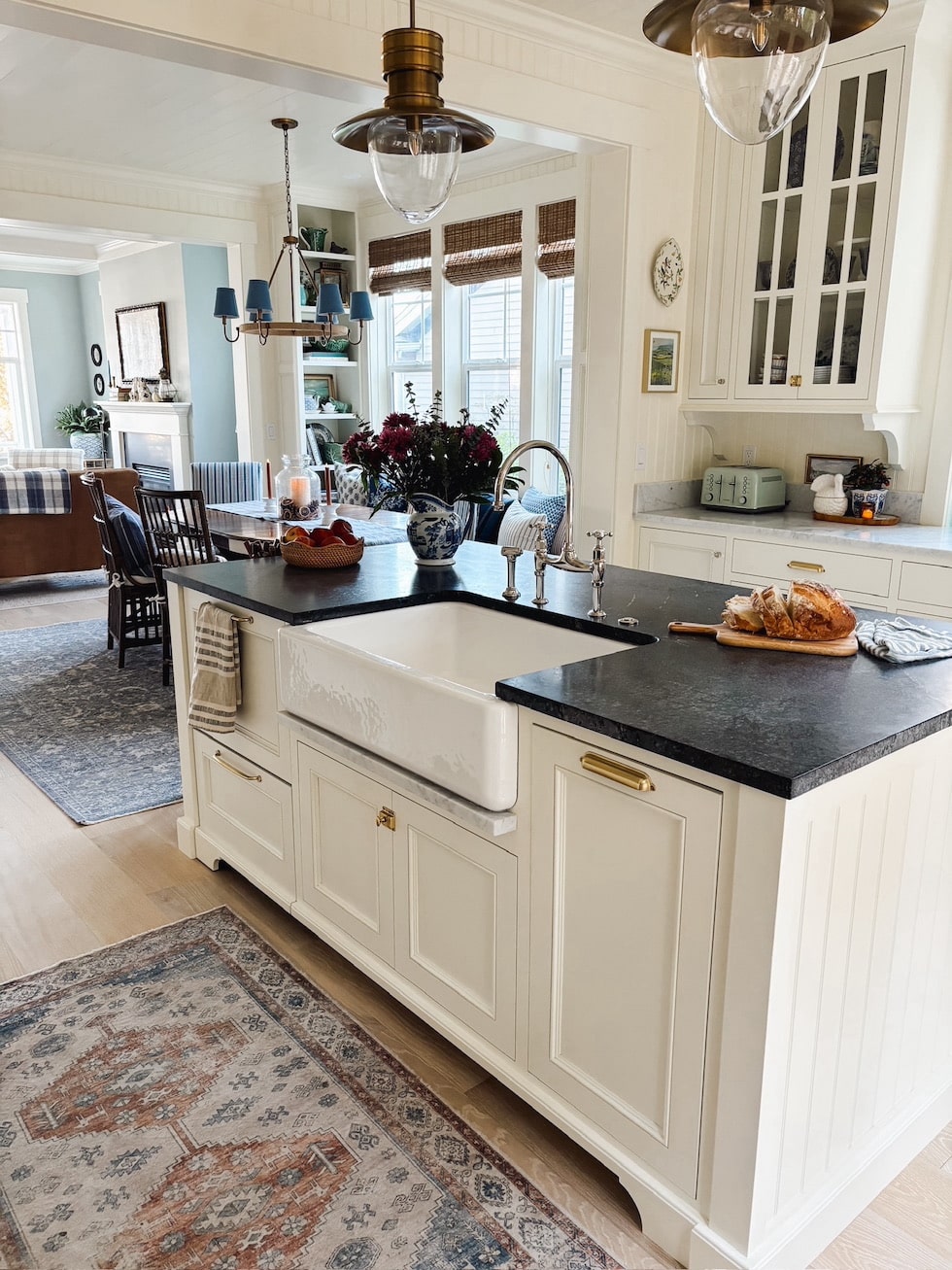
Because our main floor is small and the rooms are open to each other, we designed each wall of the kitchen and dining room to not only maximize storage but to be a pleasant view from every angle.
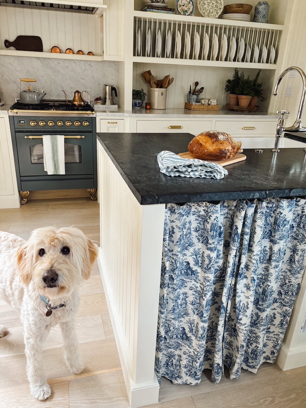
We didn’t want the sink or stove to be the main view from the front door, nor did we want any appliances to be a focal point of the design. All of our appliances are integrated with cabinetry panels (except the stove!). While our stove (who we named Beatrix) is truly the Queen Bee, she’s a special jewel that comes into view as you approach the kitchen rather than demanding visual attention throughout the rest of the space.
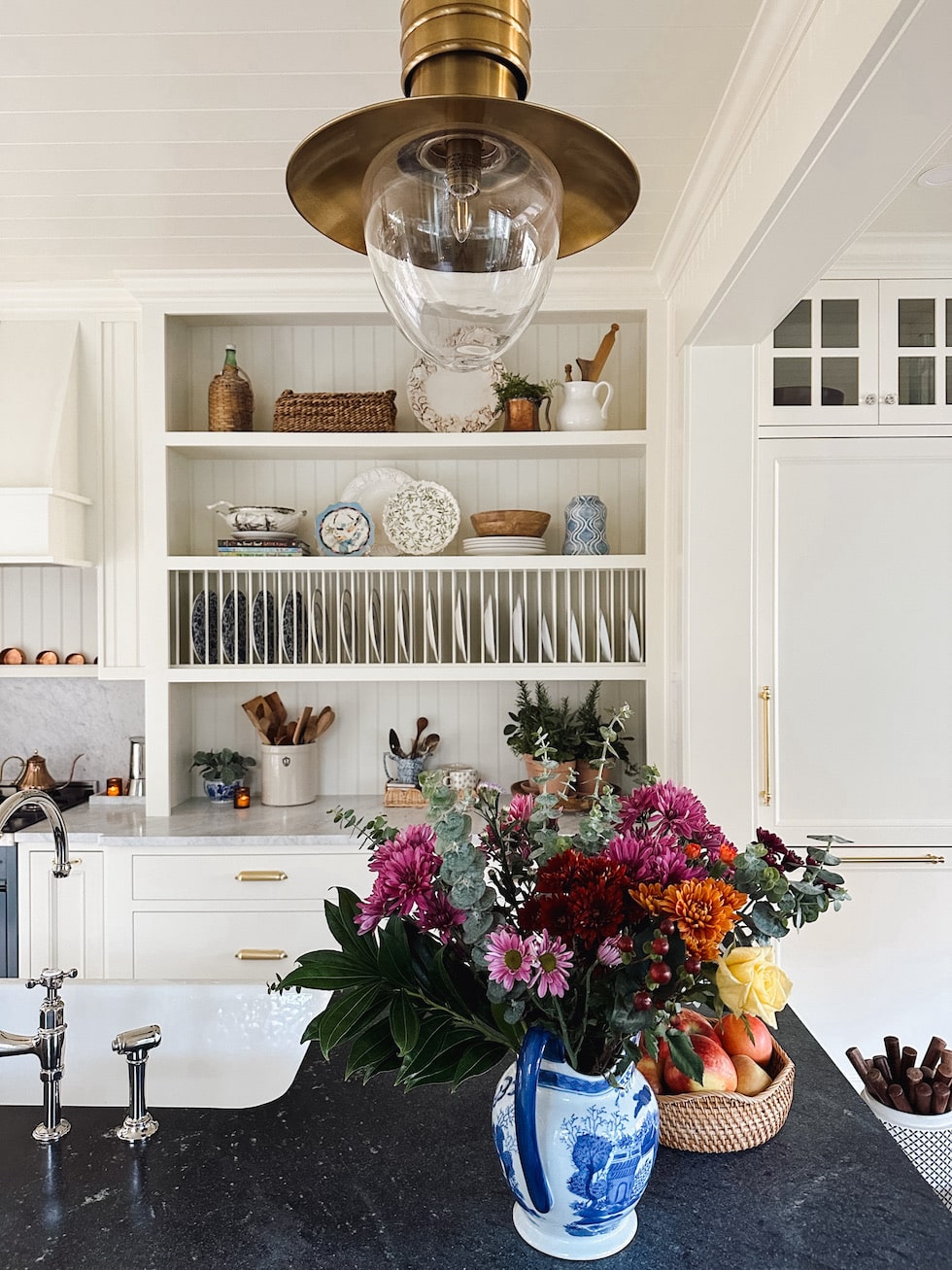
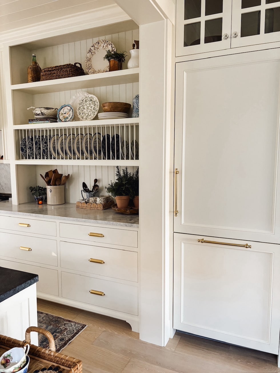
Since we wouldn’t have room for china cabinets or buffets like one might in a traditional dining room, we added a custom plate rack and display shelves as well as glass cabinets in the kitchen to give us the same function and look!
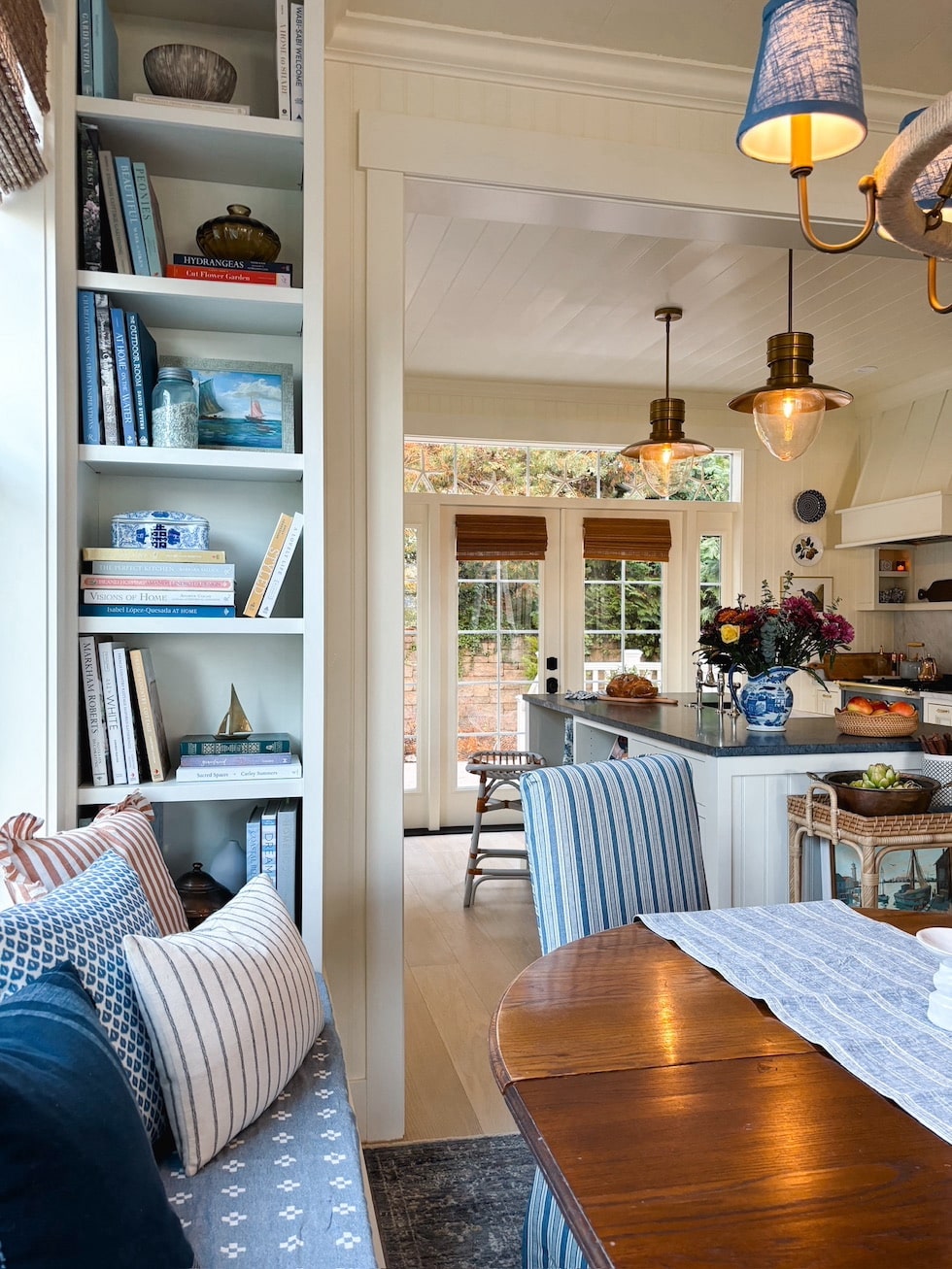
We were able to squeeze in the book nooks in the teeny space left once the windows were relocated from the kitchen and installed in the dining room.
The dining bench has a temporary DIY no-sew cushion we made ourselves to tide us over until we can have an upholstered cushion made sometime next year. It was really easy to make so if you need one, I’ll share how in an upcoming post.
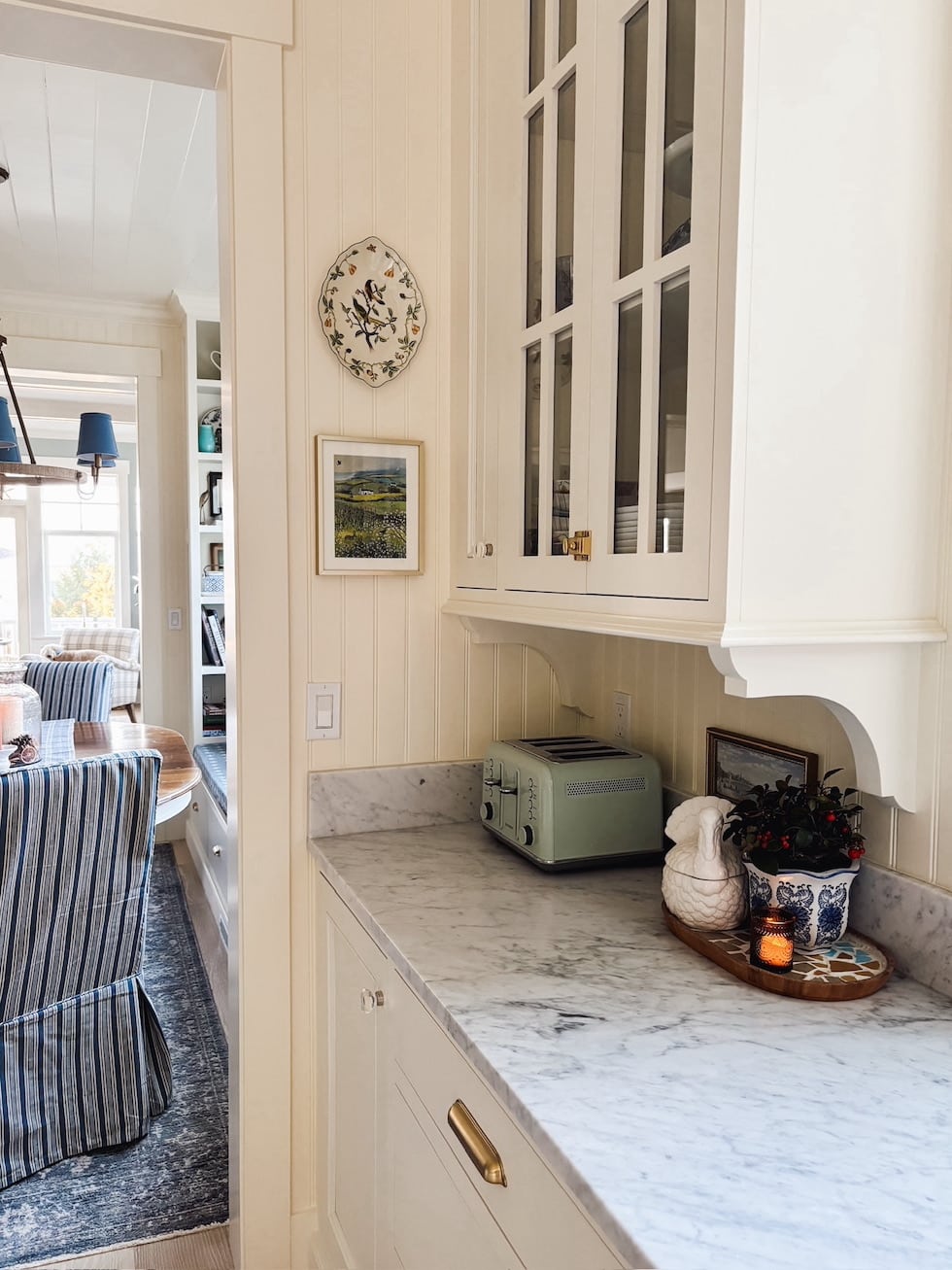
Since we have so many doors, windows and openings we needed to carefully maximize every available wall for storage as well as to be mindful of the view from each area of the main floor. The two glass cabinets on either side of the existing window were chosen to be an attractive and functional feature as it would be seen from the front entry (void of all appliances and minimal day-to-day kitchen mess).
The long unobstructed counters allow us a place to serve buffet style as well as where family can help prep food. It’s so handy to have this space outside of the main triangle where the chef is working! We LOVE having all of the drawers and storage here.
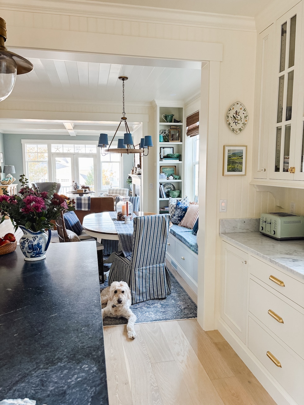
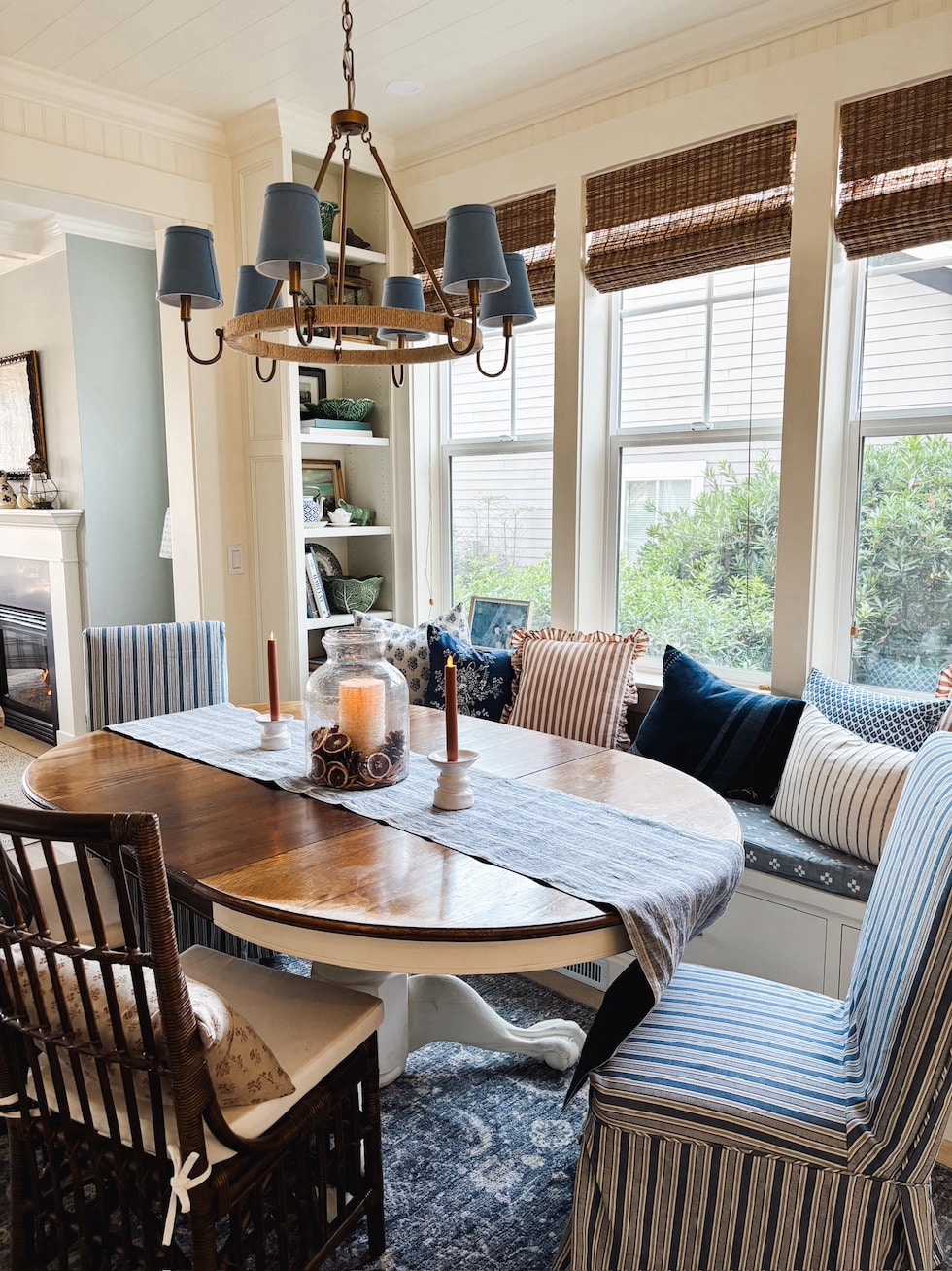
The dining nook seats the same number of people as our previous dining room, except now we have more floor space where people can easily walk through or grab coffee from our coffee cabinet. We also have room to add another table when needed!
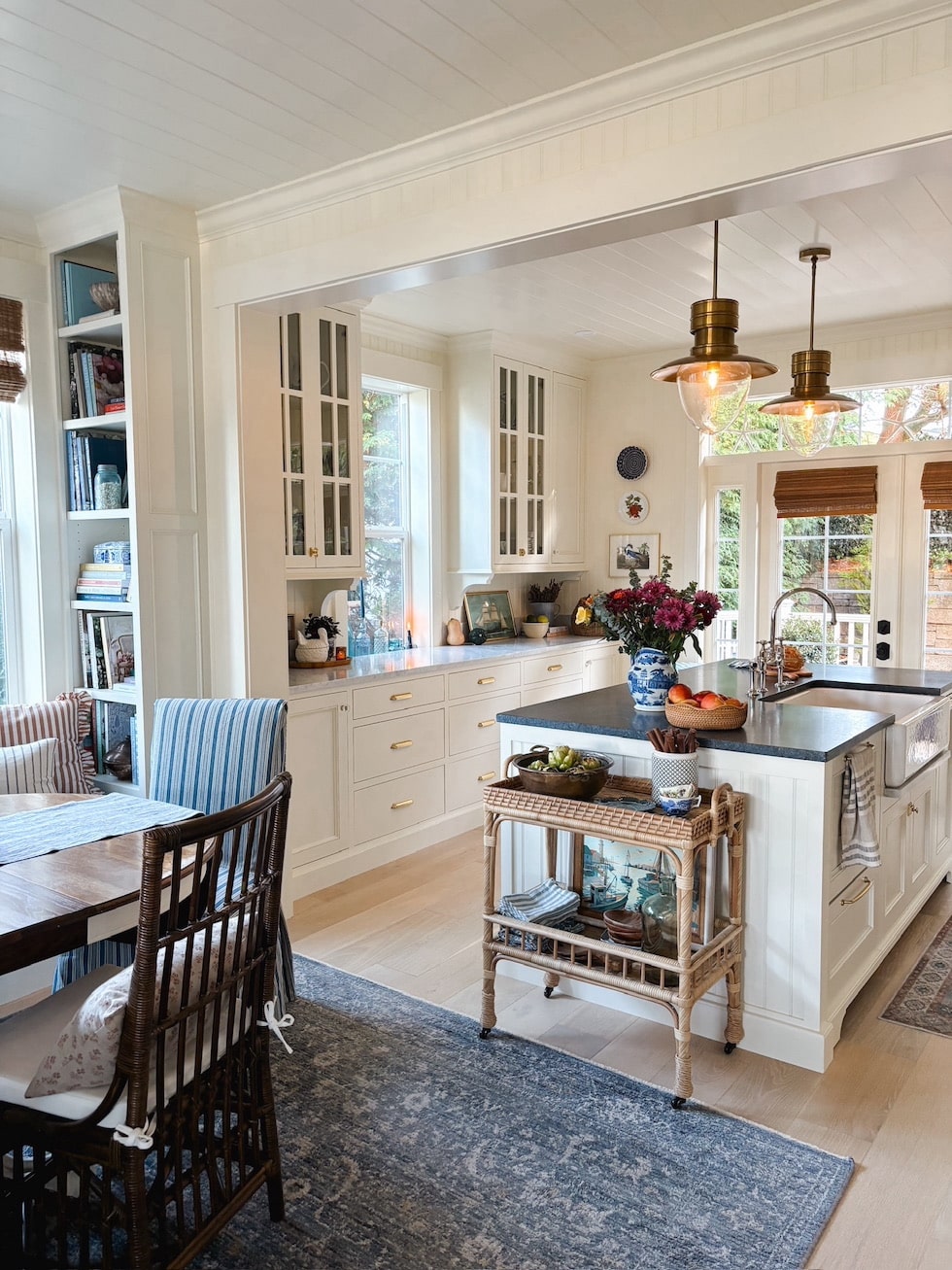
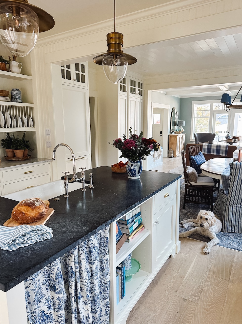
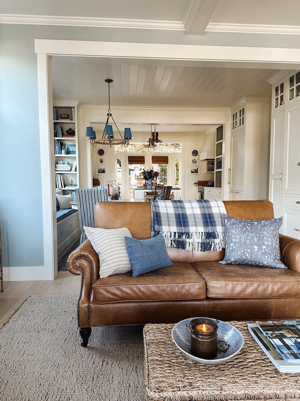
You can see here how the living room and dining room connect. I love that people can flow easily now from room to room. It’s easy to turn furniture around or pull up a chair to create more conversation areas in all spaces.
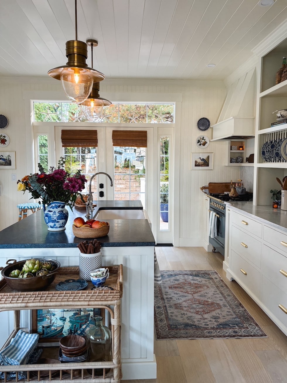
The kitchen is a dream to work in. Now we have plenty of space for multiple people in the kitchen. There’s room for someone to cook, wash dishes, and lay out food or put things away without running into anyone! We also enjoy having so much counter space to work with. It will be a breeze to serve buffet and potluck style for holidays and gatherings.
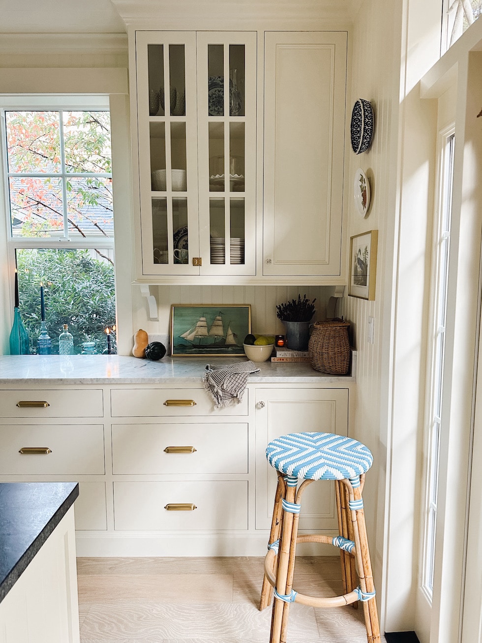
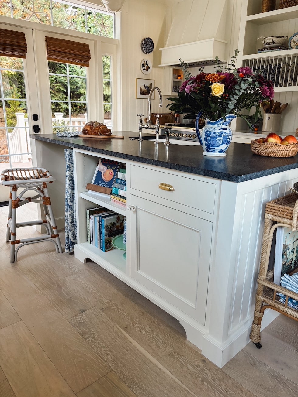
The perimeter counters are honed Carrara Marble and the island is honed soapstone. We chose not to oil the soapstone because we love the blue green hue! I’ll share more about our countertops in upcoming posts, but we LOVE them both.
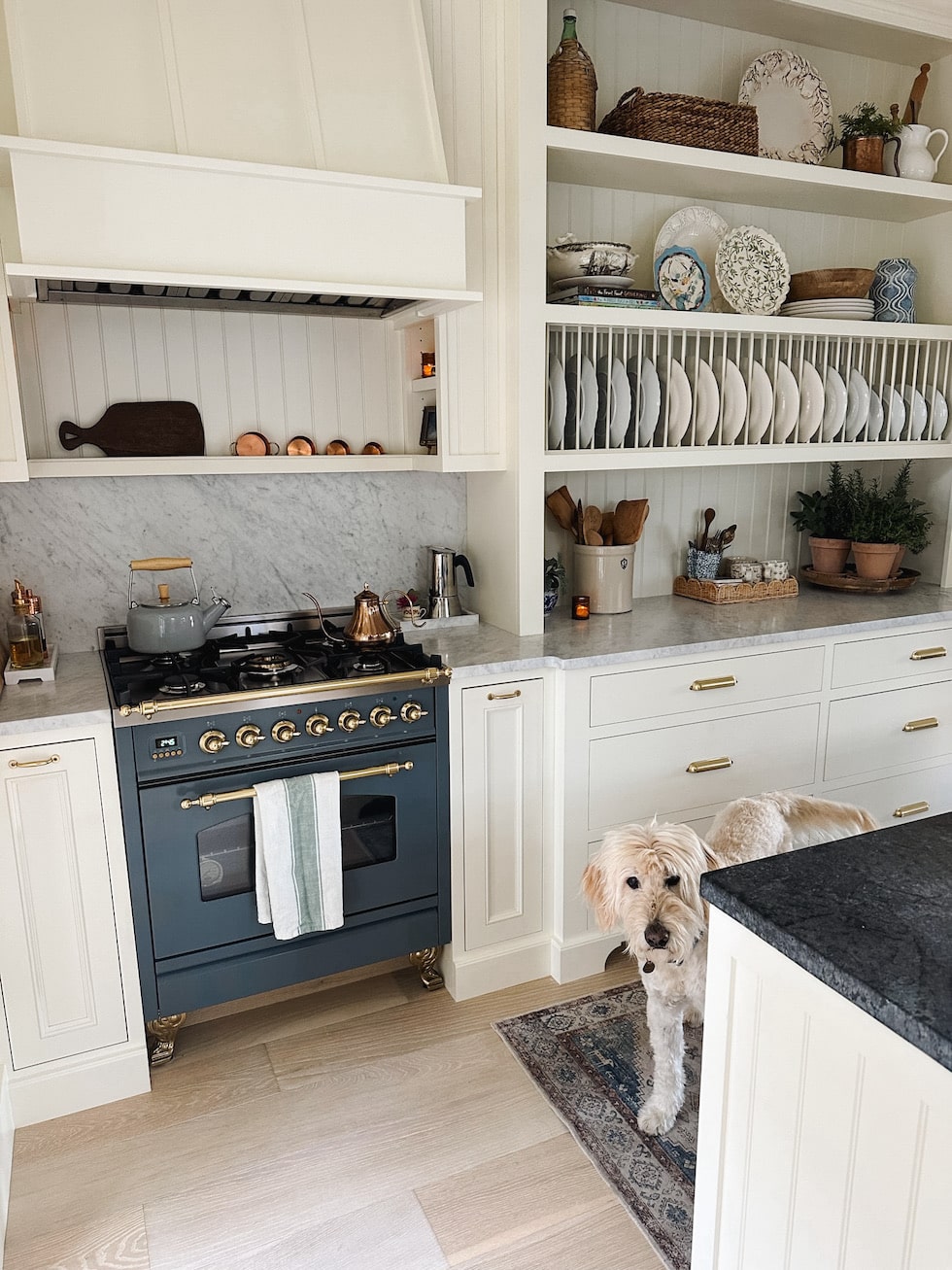
Jack (and Lily) is so happy to have our home back together again.
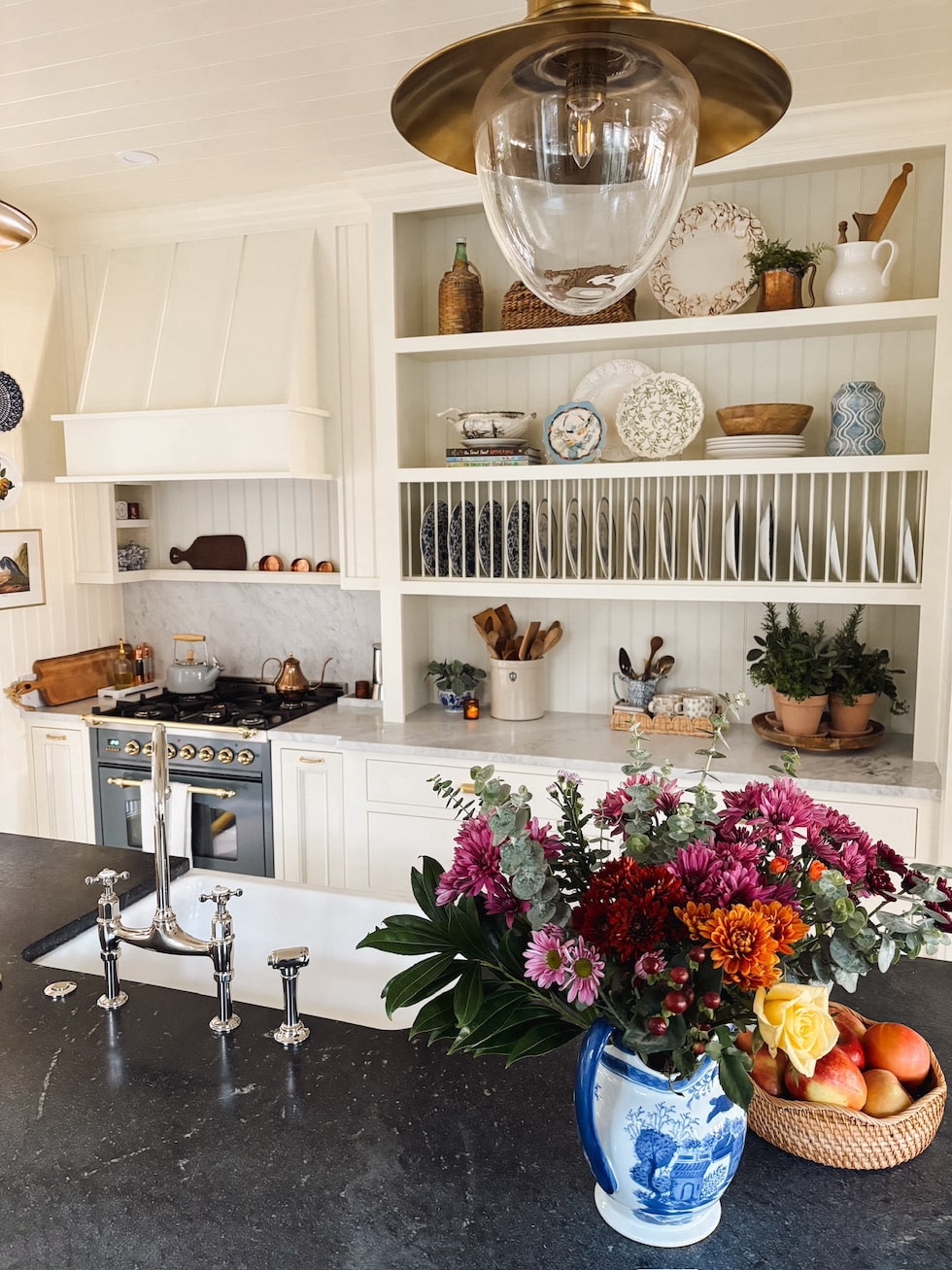
The faucet was my first purchase for this kitchen! I had a Rohl in our English Tudor and have missed it ever since. I got mine through DeVol, but you can also find a similar one HERE.
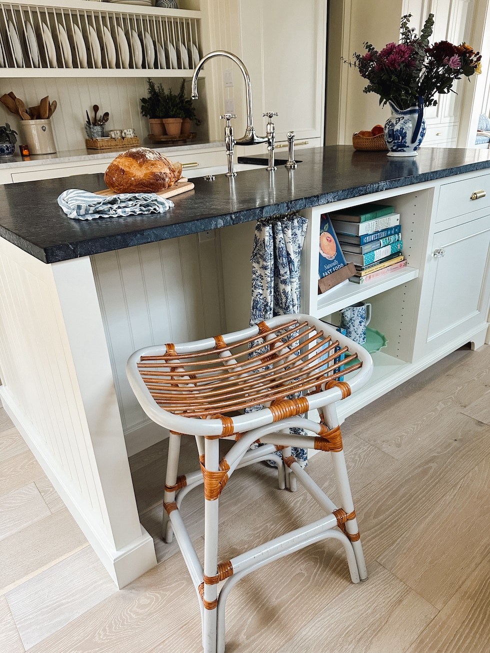
This is a little cubby for our kitchen stool. We added the toile cafe curtain as it reminds us of our English Tudor kitchen where we had a red toile chair! It’s easy to slide open on this rod with these rings. The rod can be removed if desired and we can also swap out fabrics for a different look in every season if we want to! My husband especially loves sitting here for breakfast. It has a nice view to the backyard, too.
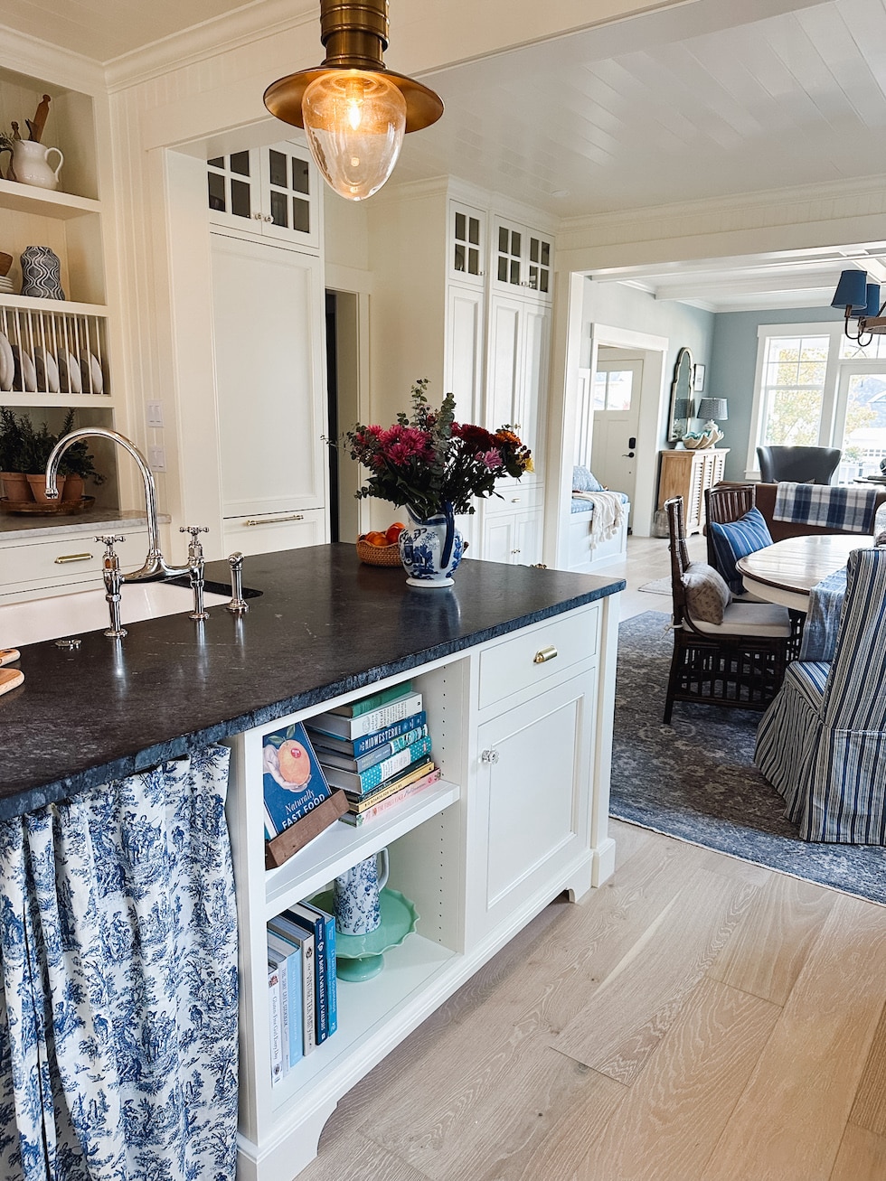
The cookbook shelves were also a nod to our English Tudor kitchen were we had a similar built in! We also did similar baseboard molding and inset cabinetry.
We treated the kitchen and dining areas as one space layout-wise so we could maximize every available wall!
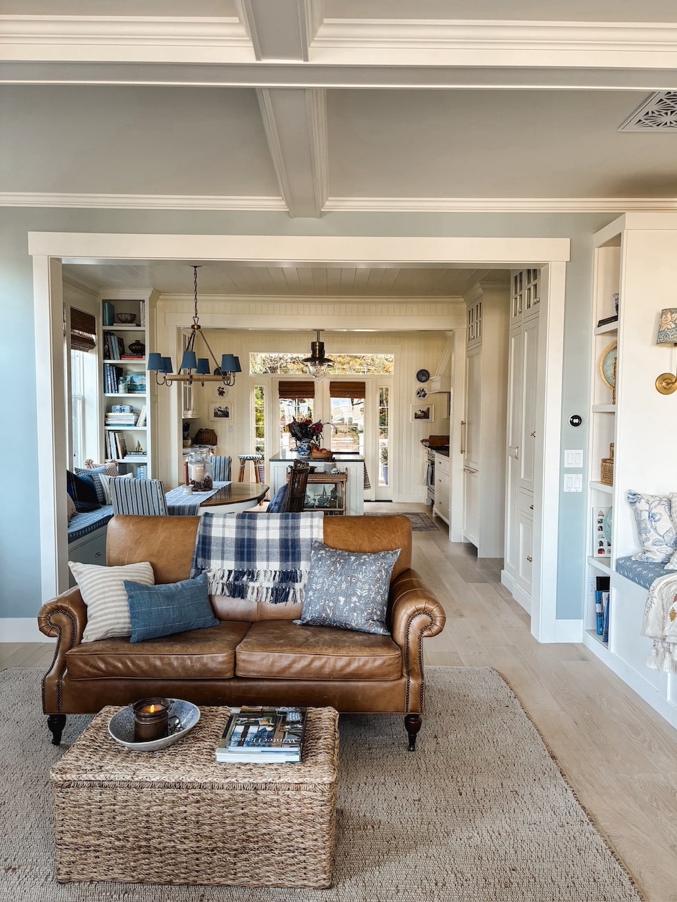
It’s still a cozy home but the flow of the spaces works really well for us now. We love the character and live in each room!
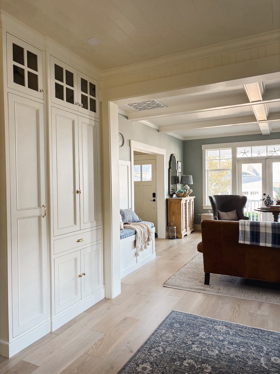
The built-in cabinetry on this side of the dining area houses our coffee station and pantry cabinets. I’ll share the inside of these in an upcoming post! This is where the previous refrigerator was located. Now we have room for people to gather and chat as they make coffee or tea here! The cabinet doors slide back in so the cabinet can be left open during a gathering or closed for a cleaner look.
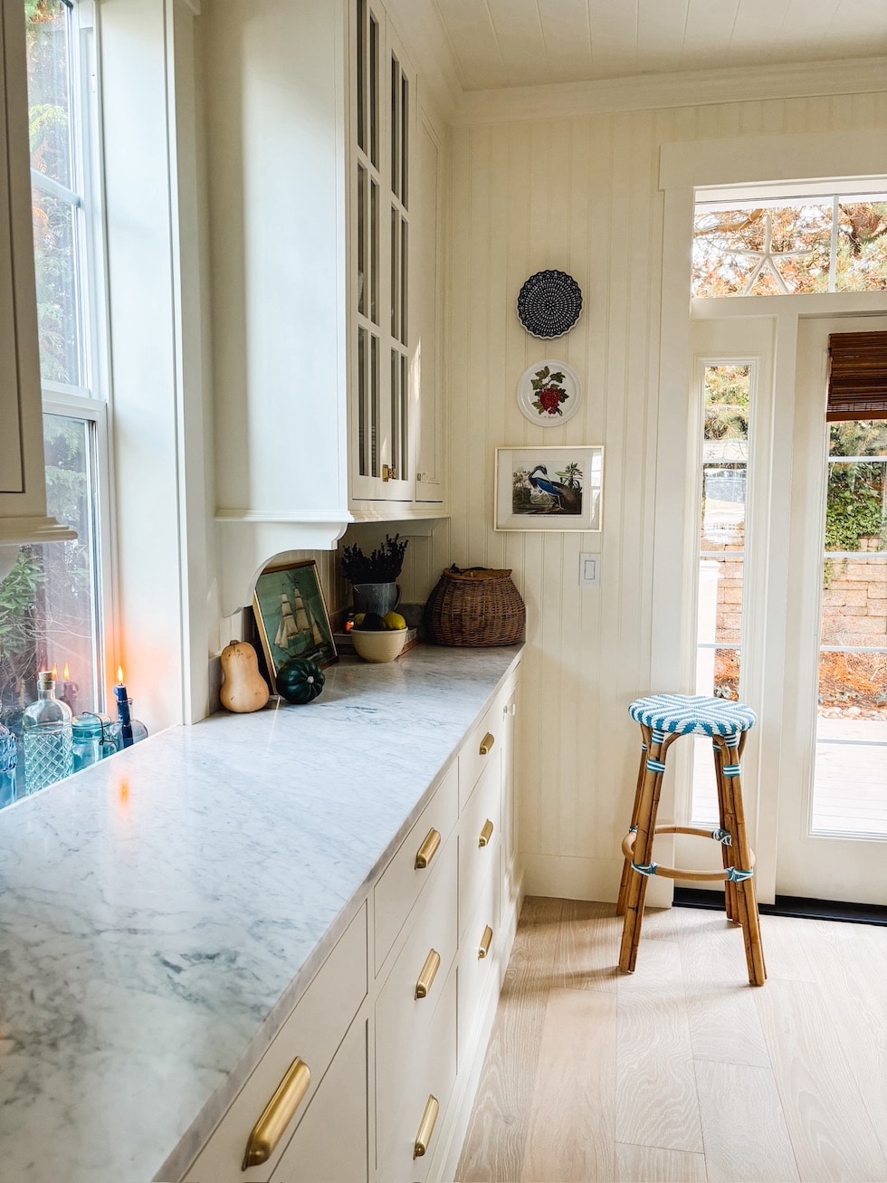
We really love the French doors to the backyard. Our back exterior changed a lot with the addition! There are also lovely new decks, gates and garden areas, so it will be fun sometime to give you a whole backyard tour! I’m especially excited to see our new plants begin to fill in and can’t wait to enjoy planting this spring.
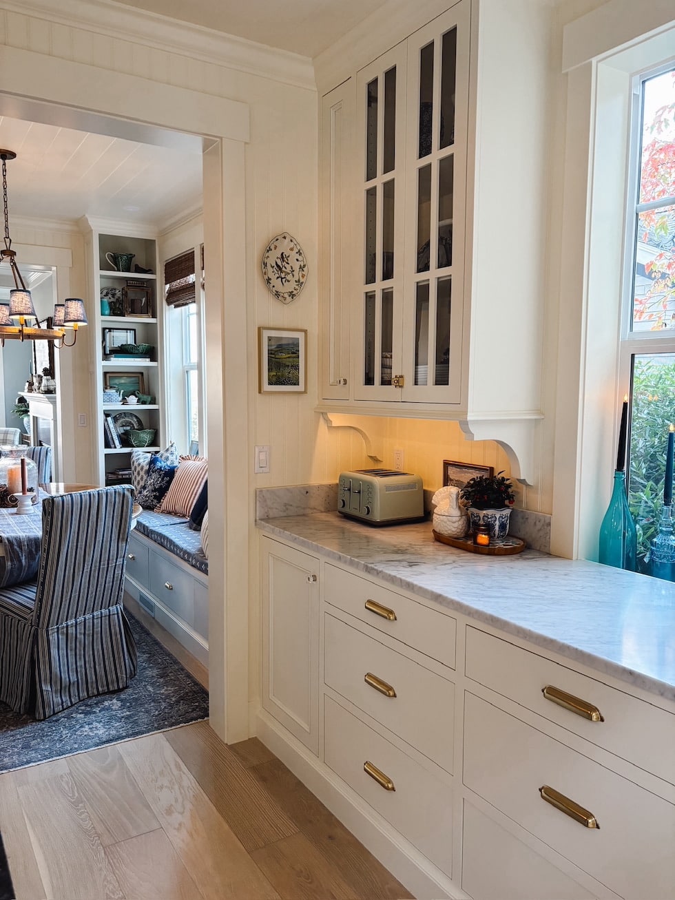
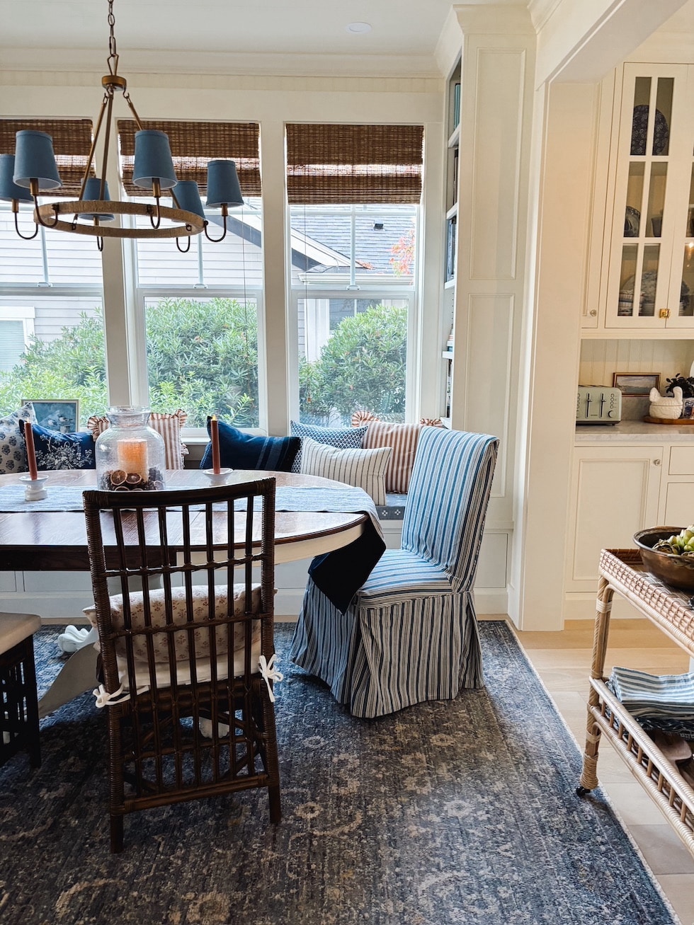
The windows that were previously located in the original dining room are now in the new dining room! This wall was where the kitchen sink used to be. We only had one tiny window and it was quite dark, but now this room is flooded with light! We really enjoy seeing the beautiful trees and bushes, as well as a surprise view of the water off to the side.
The bench not only provides seating but lots of great storage in the drawers underneath as well. The DIY no-sew bench seat works well, so I’ll share more on that later.
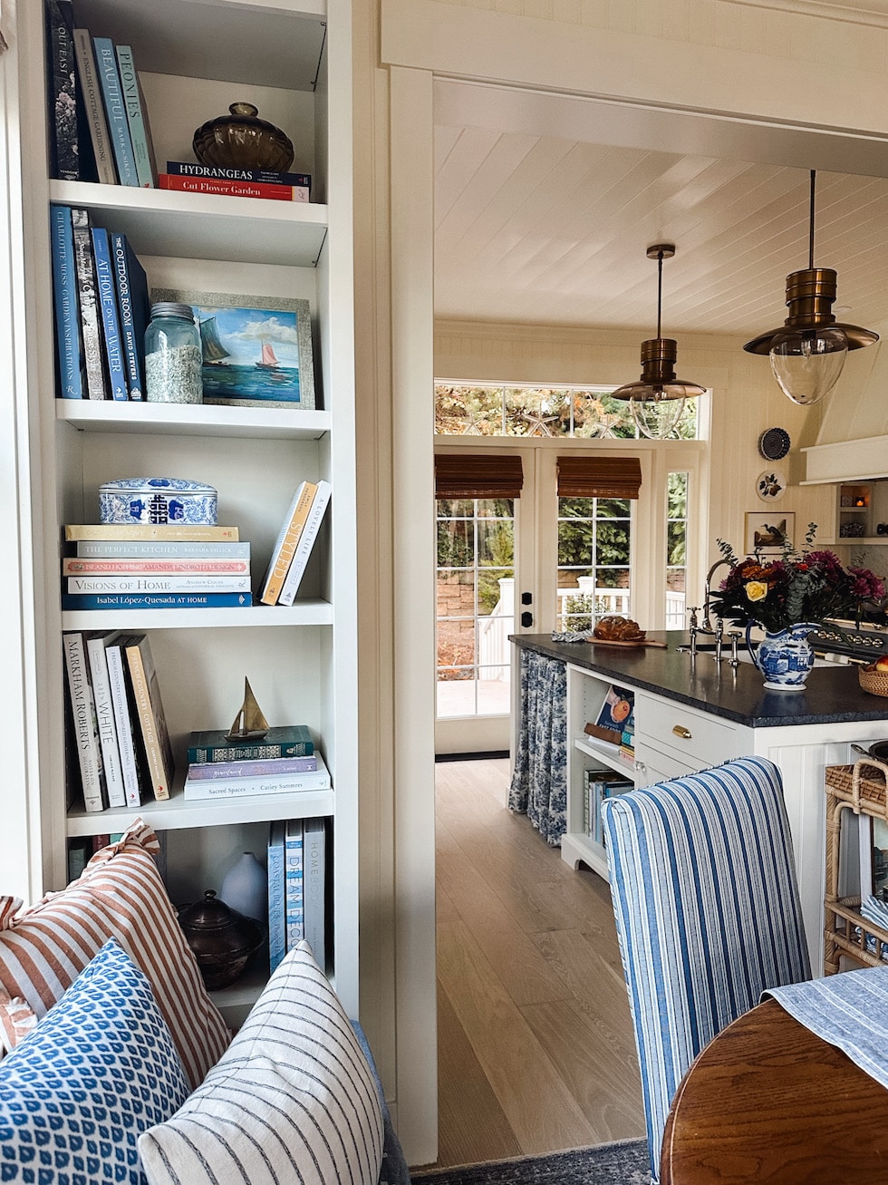
We got all new European White Oak flooring throughout our home since we couldn’t match the existing and the upstairs was all older carpet. It offers a beachy look and makes the whole house feel so much lighter!
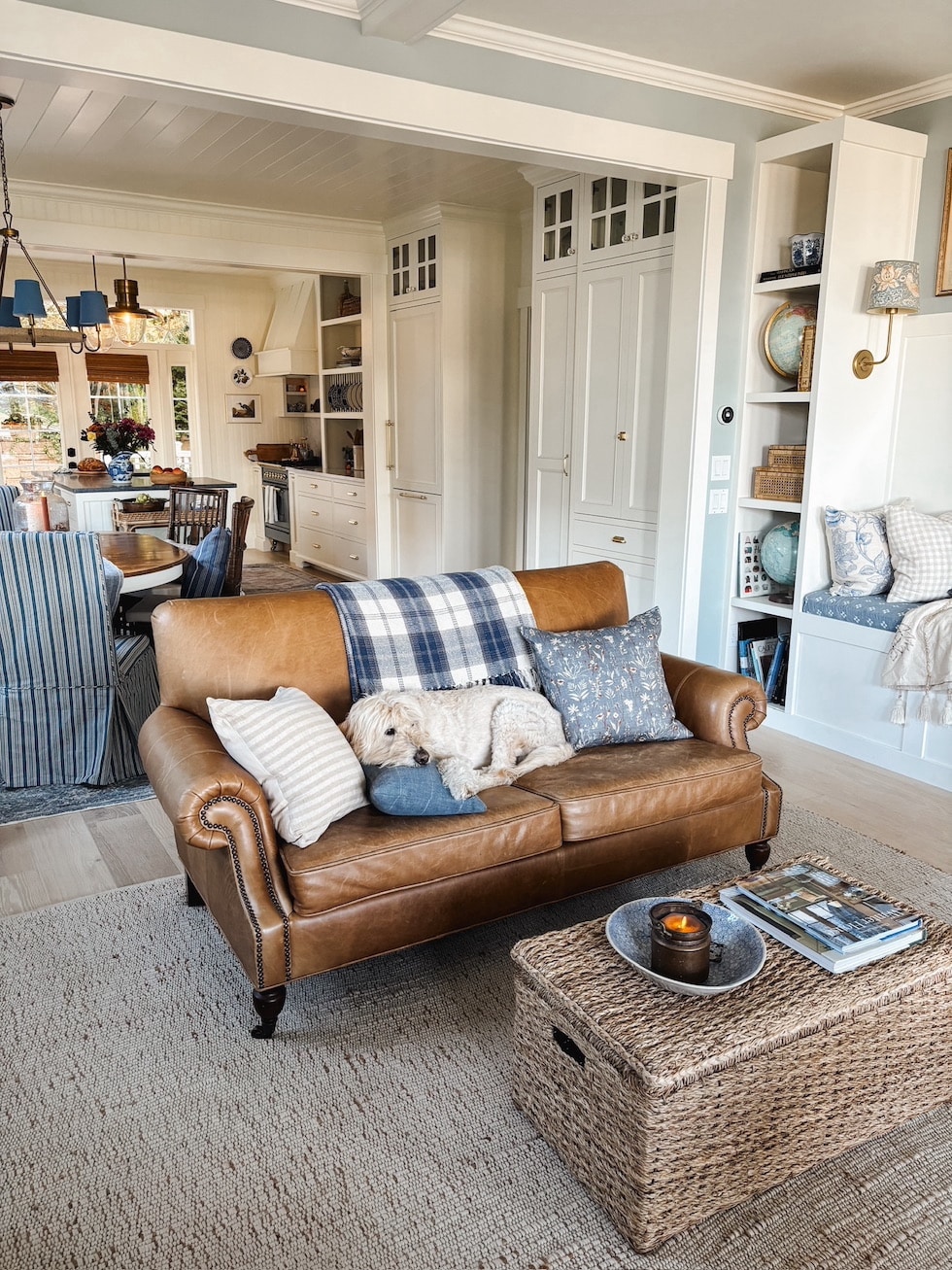
You can see the whole main floor above, except not pictured is our small entry with the staircase, plus the mudroom and powder room which are accessed between those to banks of cabinets. Also through the mudroom is how you get to the Tiny Cottage! I’ll share those spaces in upcoming posts.
Hope you enjoyed this first look at our coastal cottage kitchen reveal! I can’t wait to share more!

COASTAL COTTAGE KITCHEN SOURCES (Some of these are on sale for Black Friday! See more Black Friday deals here).
Blue Range Stove (mine is the 30 inch in Blue Gray / Grey) – read more about our range in this post
Similar Blue Plate on Wall – see How I Hang Plates here
Amber Votive Holder with Battery Votives
Rattan Serving Cart (see more photos in my home here) // Accessories on Cart
Blue and White Toile Curtain (hung with this tension rod and these rings)
Rattan and White Stool Under Island (other finish options)
Blue and White Rattan Bar Stool – Similar 1 //// Similar 2 //// Similar 3
Ship Art: Mary Maguire (see more coastal art I love here)
Nickel Faucet – This faucet on Amazon is the same brand, finish and style of faucet I have, but I bought mine through deVOL Kitchens. It appears to be a special deVOL edition and the price I paid was far less than the version on Amazon
Toaster (color options)
Hot Water Kettle (color options)
Marble Tray (by range)
Scalloped Rattan Tray (on counter with mugs)
Round Rattan Scalloped Basket (on counter with apples)
Wood Board (on counter with bread)
Blue and White Pot (on counter with holly)
Cabinet and Wall Paint Color – Classic Light Buff Sherwin Williams
Countertops: Soapstone island and Carrara marble counters on the perimeter (read more about our countertop choices here)
Flooring: Real European White Oak hardwood, engineered (I unfortunately don’t have a link to them — they were purchased through a local store and have no brand name I can find online)
Tongue and groove beadboard on the walls V-groove tongue on the ceiling
DINING NOOK SOURCES:
Patterned Rug (Ocean/Gold color)
Blue Striped Slipcovers (Downey Blue fabric)
Rattan Dining Chairs – Similar mine were from here but out of stock
Jute Wrapped Chandelier with Shades (lots of shade options)
Dining banquette bench fabric – this reversible throw blanket (I’ll share more about how we did this in a future post!)
Blue and White Striped Table Runner
Centerpiece Details
Rust Colored Battery Operated Taper Candles (moving flickering wick–see more battery candles I love here)
Favorite Design Books (many of the ones on my shelves)
V-groove tongue and groove on the dining room ceiling
LIVING ROOM SOURCES:
Leather Sofa Armchair Version (loveseat no longer sold)
Blue Plaid Throw on Back of Sofa
Jute + Cotton Rug with this rug pad
Brass Wall Sconce with this Patterned Lampshade
Wall Paint Color: Beach Glass Benjamin Moore
Trim Paint Color: Classic Light Buff Sherwin Williams
Find more sources from my home and similar styles in my shop!
Be sure to subscribe to my emails so you won’t miss future kitchen updates! I send out one or two a week with free decorating tips, my favorite home decor finds and links to new posts, so if you don’t receive them, put your email address in here!

Credit : Source Post


